
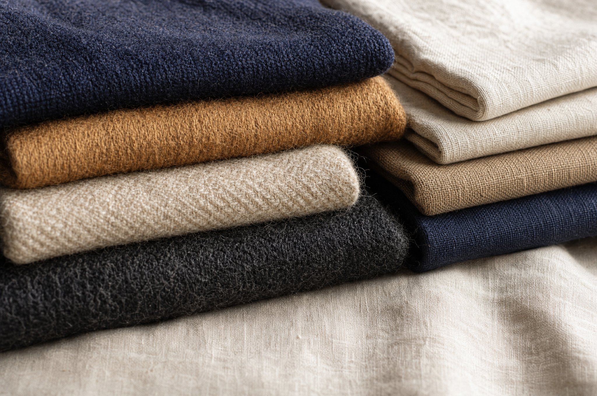
Most men approach colour in clothing the way they approach a buffet: they take a bit of everything, hope it works together, and end up with a plate that doesn't make sense. A red shirt here, a green sweater there, a pair of tan trousers that don't go with anything. The closet fills up, but every morning brings the same problem — nothing coordinates.
The solution isn't learning the colour wheel. It's building a disciplined range — a wardrobe where most things match most things by design, not by accident. This is less about theory and more about restraint. Here's the system.
The Foundation: Neutrals
A coordinating wardrobe starts with neutrals — colours that go with everything because they compete with nothing. In menswear, the core neutrals are:
- Navy: The most versatile dark neutral. Pairs with every other neutral and most accents.
- Grey: From light heather to charcoal. The bridge between dark and light.
- Charcoal: A darker alternative to navy. More formal, slightly less versatile.
- Cream/Ivory: The warm light neutral. Softer than pure white, more flattering on most skin tones.
- Olive: The "earth neutral." Pairs with navy, grey, and brown. Adds a natural, grounded tone.
- Brown: From tan to chocolate. The warm counterpart to grey.
These six colours form the backbone of a coordinating wardrobe. Every foundational piece — trousers, jackets, sweaters — should come from this list. When your foundation is all neutrals, any neutral top works with any neutral bottom. You've just solved 80% of coordination.
If your closet is full of neutrals that all work together, getting dressed becomes trivial. The problem isn't a lack of colour — it's a lack of discipline.
The Structure: 70/25/5
Once you have the neutral foundation, build the wardrobe around a simple ratio: 70% neutrals, 25% muted accents, 5% statement colours.
The 70% are your workhorses — navy trousers, grey sweaters, white shirts, charcoal jackets. These are the pieces you wear most often, and they need to pair with everything. By keeping them neutral, you ensure they do.
The 25% are muted accent colours — colours that are desaturated enough to function almost like neutrals but add visual interest. Think: burgundy, forest green, dusty blue, mustard, burnt orange, rust. These pair with all the core neutrals but add personality. A burgundy sweater over a white shirt with navy trousers is coordinated and interesting without being loud.
The 5% are statement pieces — bright or saturated colours that you wear rarely and intentionally. A red knit, a bright patterned shirt, a bold accessory. These exist for moments when you want to stand out, but they should be rare. If more than 5% of your wardrobe is statement colour, you'll struggle to coordinate.
Pull ten random items from your closet. How many pair with at least seven of the others? If the answer is less than seven, you have a coordination problem — and the fix is more neutrals, fewer accents.
How Colours Actually Combine
Within the neutral-and-accent system, certain combinations are proven to work. These aren't rules — they're reliable patterns that menswear has settled on over a century of practice.
| Bottom | Top | Character |
|---|---|---|
| Navy | White, cream, light blue | Classic, clean, universally safe |
| Grey | Navy, burgundy, forest green | Smart, balanced, business-ready |
| Charcoal | White, light blue, cream | Formal, sharp, winter-leaning |
| Olive | Cream, navy, brown | Earthy, casual, autumnal |
| Brown/Tan | Navy, cream, olive | Warm, relaxed, country-leaning |
| Denim (indigo) | White, grey, navy, burgundy | Casual, versatile, everyday |
Notice the pattern: dark bottoms with light tops (high contrast, clean), or tonal combinations (navy with navy, grey with grey — low contrast, sophisticated). The combinations to avoid are two saturated colours competing for attention — a red sweater with green trousers, for instance. One piece should be quiet while the other speaks.
The Concept of Contrast
Beyond specific colour pairings, the principle that governs coordination is contrast — the difference in lightness between your top and bottom. There are three approaches:
High contrast
Dark bottom, light top (navy trousers, white shirt) or light bottom, dark top (tan trousers, navy sweater). High contrast is crisp, clean, and draws the eye. It's the safest and most classic approach — and it flatters most body types by creating a visual vertical line.
Low contrast (tonal)
Similar lightness top and bottom (charcoal trousers, navy sweater, or tan trousers, cream sweater). Tonal dressing is sophisticated and modern — it reads as deliberate and stylish. The risk is that it can look monotonous if the textures don't vary. Always introduce texture (a knit against a woven, a smooth fabric against a textured one) when going tonal.
Medium contrast
The middle ground — a mid-tone bottom with a light or dark top (grey trousers, white shirt; olive trousers, navy sweater). This is the most versatile approach and what most well-dressed men default to.
Texture as a Colour Multiplier
Here's a secret: when you keep your colour palette narrow, texture becomes your primary source of visual interest. Two navy pieces — a smooth worsted blazer and a rough tweed sport coat — look completely different despite being the same colour. Texture creates contrast without requiring colour contrast.
This is why a tonal outfit (all navy, all grey) can look rich rather than flat — the textures are doing the work. A smooth worsted wool trouser with a cashmere sweater in the same colour family creates depth through surface difference. A tweed sport coat over a flannel shirt, both in brown tones, is more interesting than two differently coloured smooth fabrics.
Build your wardrobe to mix textures within a narrow colour range, and you'll never look monotonous — even when your palette is essentially five colours.
The Accent Rule: One Per Outfit
When you do introduce colour — a burgundy sweater, a forest green knit, a pair of rust trousers — follow the one-accent rule: one accent colour per outfit, paired with neutrals. A burgundy sweater with navy trousers and a white shirt is one accent. A burgundy sweater with green trousers and a patterned shirt is chaos.
The accent should be the focal point — the piece the eye lands on first. Everything else should support it, not compete with it. This is the difference between "I'm wearing a great sweater" and "I'm wearing a lot of colours."
Seasonal Colour Shifts
Colour isn't static across the year — the palette shifts with the seasons, and a coordinating wardrobe accounts for this. Spring and summer lean lighter and cooler: cream, light blue, soft grey, faded olive. Autumn and winter lean darker and warmer: charcoal, burgundy, forest green, rust, brown.
The neutrals stay constant (navy and grey work year-round), but the accents rotate. This is why a well-built wardrobe feels seasonally appropriate without requiring entirely separate clothes — you're shifting the accent layer while the neutral foundation holds steady. See our seasonal layering guide for how this works in practice.
Building It
Start by auditing your current wardrobe. Pull out every item and sort it into three piles: neutrals that coordinate with each other, accents that pair with those neutrals, and orphans — pieces that don't go with anything else. The orphans are the problem. Most of them should go.
Then fill the gaps with neutrals first. A capsule wardrobe built on navy, grey, and white, with two or three muted accents, will coordinate effortlessly. Every morning, you'll reach for any top and any bottom, and they'll work together — because you designed them to.
That's the whole point. Coordination isn't a skill you practise each morning. It's a system you build once, by choosing colours that get along, and then reaping the simplicity every day after.